


Jonathan Schofield asks if more colour could be used in new architecture... and gets told no
IT WAS two weeks ago when the Town Hall exploded, and then the former brick warehouse on Central Street followed by the old YMCA, now Saint George’s House. The Midland hotel was already on fire. And there at the end of Mosley Street West was the apocalypse (or at least a very dramatic sunset) igniting the city.
The buildings mentioned above are built from traditional materials, stone, terracotta and brick, in other words natural materials crafted from rock or clay. The colours and tones of nature have a built-in ability to reflect the atmospherics, to spring to life with colour.
But what about recent buildings? What about their colours? At a recent Cityco debate this was one of the questions raised. Given the freedom the digital age has given architectural design, given all the new materials, why are so many of our new buildings seemingly so drab?
David McCall of OMI architects gives some background: “Up until the Industrial Revolution we generally built buildings with the materials that were at hand, stone from the quarry next door, brick from the nearby clay pit and timber from the forest. This created towns and villages that have a consistent quality.
"The builders of yesteryear didn’t fret over the validity of one material over another because there was no choice. Where there was a choice the decision would be made on cost and the importance of the building (banks and churches in stone, house fronts in brick, house backs in cheaper brick).”
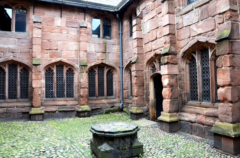
If we think of this city in that context then the best example is Chetham’s, with its medieval buildings built from Collyhurst pink sandstone. These are so fitting they seem to have grown from the ground, not been built.
McCall continues: “Industrialisation in manufacture and transport has meant we can produce a vast array of cladding materials in a range of colours brought in from across the globe. Where people are given a choice there is always the risk it will be the wrong choice.”
Central Manchester and Salford, indeed the UK, are taking plenty of risks with colour at present. Some are worth taking and some have failed. But often it appears that perhaps there isn’t enough effort to create the vibrancy and distinctiveness of so many of the stone, brick and terracotta buildings of ‘yesteryear’. Ok, these were built from the materials to hand, but in the commercial areas of the city centre they invariably attempt flair. They were built with a desire to impress and entertain.
Owen William’s 1930s Daily Express Building on Great Ancoats Street is black and looks more modern than most 21st century buildings in the city
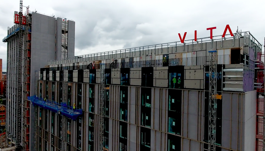
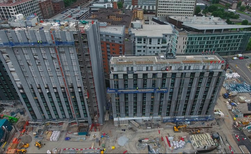
An example discussed in the Cityco debate was the colour palette chosen in Circle Square, the Bruntwood development on the old BBC site off Oxford Road. There has been much social media comment about this with 5Plus architect's VITA development the target: a series of light-sucking matt black or matt grey buildings. According to Aisling McNulty of Bruntwood the palette for the development was taken from the dark hues of the older industrial buildings in the area.
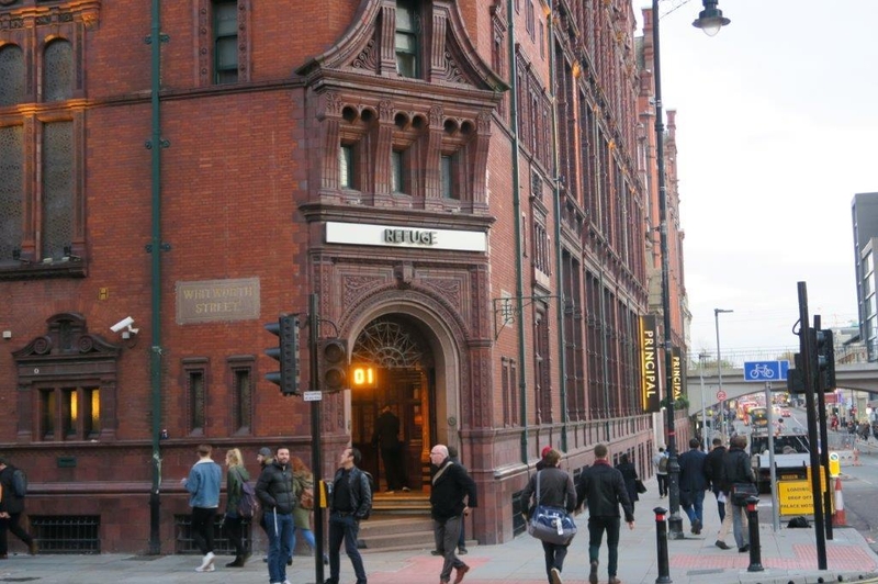
This is curious. If she meant the mills and warehouses then they were built to a budget and based on simple practicality. Most other commercial buildings were, as noted already, about flamboyance and showing-off. Around the corner from Circle Square is the extraordinary fandango of the Principal Hotel, formerly the Refuge Assurance, and almost next door the ridiculously over the top but rewardingly crazy Baroque of St James’ Buildings. One is terracotta and brick, the other white Portland stone. Down from St James’ Buildings is the vivid, shiny green tiled pub The Peveril of the Peak.
If Circle Square had taken its palette from these two then the city would be looking forward to a much brighter development. It appears Glen Howells Architects took the white Portland stone of Central Library opposite as the model for One St Peter’s Square to splendid effect.
Not that black can’t be superb, but it has to bold. Owen William’s 1930s Daily Express Building on Great Ancoats Street is black and looks more modern than most 21st century buildings in the city. The new building in First Street, Number 8, by Fletcher Priest Architects, is starting to look good in black especially given the articulation of the fenestration and the cut-aways.
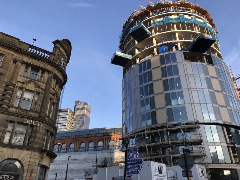
Another trend seems to be for beige or light mud brown structures. The wrap of the circular Indigo Hotel building going up next to Victoria Station is a case in point. The shades and tones here are, as a friend commented, ones you were told to avoid when buying underwear. There are many other examples going up across the city.
"Architects are taught to avoid colour, especially primary colours, and stick to a pallet of natural materials"
Yet, you can understand architects being cautious.
“I think you have to be careful with unnatural colours,” says Stephen Hodder. “Of course colour can be used to give accent to a building in an appropriate context, but it can quickly date a building...witness the red highlights of the British Library (a very good building nonetheless) in London.
"From a personal perspective, I try to seek a permanence which is why I shy away from unnatural external coloration. Internally, it’s quite another matter, where people engage more intimately with a building, or colour can be temporary or changed over time.”
McCall agrees, “Architects are taught to avoid colour, especially primary colours, and stick to a pallet of natural materials. Most architectural drawings are monochrome, at least prior to computers, with possibly a light water colour wash. We are more interested in light and shade.
"Modernists like Corbusier did experiment with colour and his interiors in particular are surprisingly colourful. He also did use bright primary colours to offset the rugged grey concrete of say Unite de Habitation (it works with the sunlight of southern France, less so with the grey skies of Sheffield at Parkhill). Corbusier even developed his own colour swatch manual which you can still buy.”
He pauses, and then delivers a few killer sentences which humanise the debate. “Buildings are generally conservative, a bit like men’s suits. Yes you can have a yellow jacket and a pair of bright red Chinos, but you better be able to carry it off and, let’s face it, few can, so even the trendiest of blokes favour traditional subdued colours.”

Dignity and restraint seems to be the model generally for architects. Roger Stephenson doesn’t break ranks: “Colour is only one component of the raw materials of architecture along with light and shadow, texture, form, surface, symbolism and so on. I think the colours of natural materials tend to stand the test of time better than 'man-made' ones.
'It so happened that anodisers managed to start producing bright colours around the time the unfortunate trend for superficial post-modernism occurred, likewise, powder coating of metal offered new possibilities. There are many sad examples still scattered all over the country.”
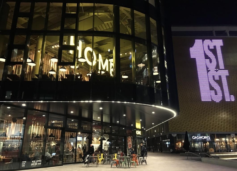
Yet, talking to lay people, splashes of colour seem very welcome. Ask’s First Street development is an example of this, where black, yellow and red buildings all liven up what could have been a grim introduction to HOME art centre (itself proudly black, albeit with a large neon name tag announcing itself through the glass). The red Innside Hotel next door provides a bold landmark for the site.
Will Alsop, when interviewed by Confidential a while ago, took a very different route from other architects. Talking about his colourful if flawed Chips building in New Islington, he said, “I wanted the public to be very aware of (Chips) and to enjoy it. We’re in an exciting period of architecture. I love the diversity that can be delivered. I want to embrace that freedom we have as designers and my way is to engage with people and give them something to talk about. I’m not interested in what other architects think. They want rules.”
Alsop is unpopular with most architects and it’s true that several of his schemes have been calamitous, but it can’t be denied that Chips attracts the eye. With its surface covered in typeface it has something of the flair of Victorian and Edwardian buildings.
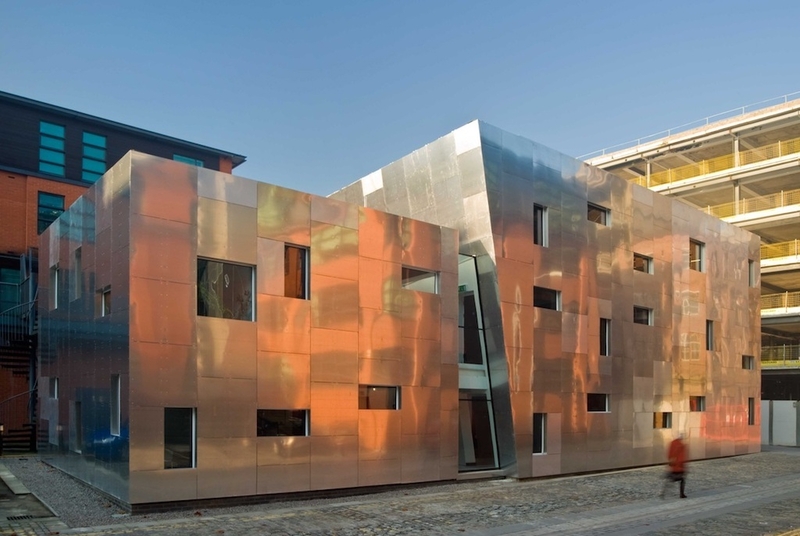
'I like First Street’s mad palette... I find the crazy silver of Maurice Shapiro’s 42nd Street building in Ancoats exhilarating'
OMI, Hodder and Stephenson are all top quality architects. The natural brick textures of Stephenson’s Chetham’s Music School illustrates the point about how discipline with subtlety can enhance the city while not offending the eyes. The same goes for the wonderful Timekeepers Square in Salford by Buttress Architects.
As McCall says: “(Let’s) advocate an approach that has buildings as subtle backdrops to our city. ‘Life’ comes from the more ephemeral components such as signage, lighting, shopfronts, canopies etc that enliven our streets.”
Yet, personally, I would welcome more colour.
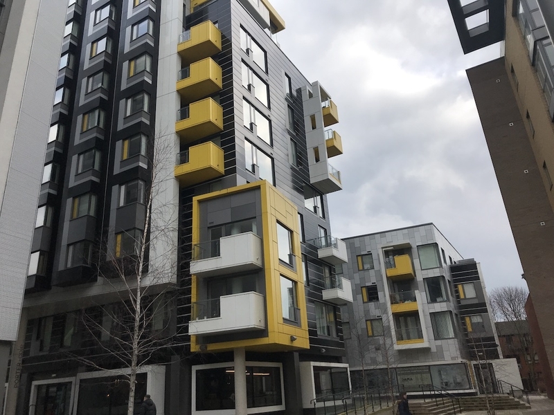
I like First Street’s mad palette. I like the yellow details on One Smithfield by Mark Weintraub Associates. I like the white tiled student accommodation towers by Hodder, just off Whitworth Street West. I find the crazy silver of Maurice Shapiro’s 42nd Street building in Ancoats exhilarating. I welcome SimpsonHaugh’s slightly manic ‘Gothic’ screen down the side of 2 St Peter’s Square. Lancashire Cricket Club’s red stands from BDP are wonderfully vivid.
Perhaps there should be a rule whereby, in large scale developments on brownfield sites, colour might flower, such as First Street. Whereas, with buildings surrounded by older buildings, then restraint should be shown, although the Shapiro building mentioned above gives the lie to that.
I suspect architects are a little out of step with much of the public in their approach to buildings. Yes, restraint and dignity are good general rules, but giving the passing public a little more colour, a little more of that Victorian and Edwardian flamboyance, wouldn’t go amiss.